Google G Logo Gradient Update: A Fresh Look for 2025
Google has rolled out a fresh update to its iconic “G” logo, marking its first change in nearly a decade. This subtle redesign, spotted in early 2025, has sparked curiosity among users worldwide. The Google G logo gradient update brings a modern twist to the tech giant’s branding. This article dives into the details of the change, its significance, and what users can expect.
Google G Logo Redesign 2025: What’s New?
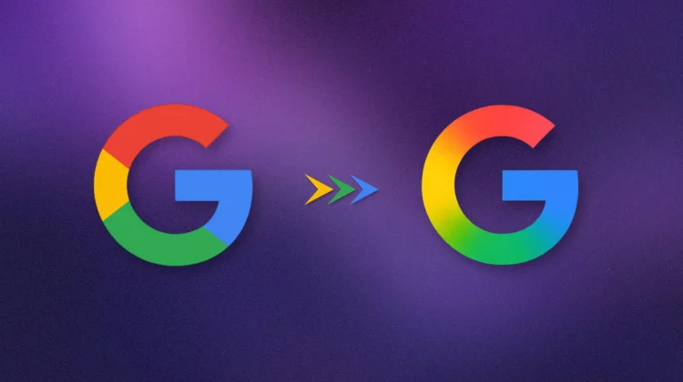
After almost 10 years, Google has tweaked the English letter “G” in its logo. The update, first noticed on iOS and Android devices, introduces a refined gradient effect to the familiar four-color design—red, blue, green, and yellow. The font and colors stay true to Google’s classic style, but the “G” now has a sleeker, more dynamic shape. This Google G logo redesign 2025 is rolling out gradually, with desktops and laptops set to follow soon.
The change is subtle, with no major overhaul to the logo’s core design. Instead, Google focused on small adjustments to the “G” letter, making it sharper and more vibrant. According to reports, the update aligns with Google’s goal to keep its brand fresh while ensuring users feel at home with the familiar logo.
Google G Logo Color Change Explanation
Why tweak an iconic logo? The Google G logo color change explanation lies in branding and visual appeal. The new gradient adds depth, making the logo stand out on modern, high-resolution screens. The four colors—symbolizing Google’s values of innovation and diversity—remain unchanged but blend more smoothly. This creates a modern, polished look that fits 2025 design trends.
The update also ensures consistency across Google’s products, like Chrome, Maps, Gmail, and Photos, many of which have seen logo tweaks in recent years. By refreshing the “G,” Google keeps its brand cohesive and engaging. The phased rollout, starting with mobile devices, minimizes disruption while introducing the change to billions of users.
Why Did Google Change Its G Logo?
The question on everyone’s mind: Why did Google change its G logo? Since its founding in 1998, Google has evolved its logo multiple times, reflecting shifts in technology and culture. At 27 years old, the company continues this tradition with small, strategic updates. Here’s why the 2025 change matters:
- Modern Design: The gradient effect aligns with current trends, giving the logo a fresh, vibrant feel.
- Brand Continuity: The update keeps the “G” consistent with Google’s other product logos, reinforcing its identity.
- User Experience: A sharper logo enhances visibility across devices, from phones to laptops.
- Subtle Evolution: Small changes keep Google relevant without alienating users who love the familiar design.
The last major logo update was in 2015, when Google adopted a cleaner, sans-serif style. Since then, minor tweaks have kept the brand dynamic. The 2025 update builds on this, focusing on the “G” to signal Google’s ongoing innovation.

User Reactions and Rollout Details
Social media, particularly posts on X, shows a mix of excitement and curiosity about the update. Some users praise the gradient’s “modern vibe,” while others barely noticed the change—a testament to Google’s subtle approach. Tech blogs note that the update reflects Google’s knack for balancing tradition and innovation.
The rollout began with iOS and Android devices, with computers and laptops next in line. Not all users see the new logo yet, as Google is updating devices in phases. This ensures a smooth transition for its global user base. The “G” may look slightly different across platforms due to optimizations for various screen types.
Why This Update Matters
A logo tweak might seem minor, but for Google, it’s a big deal. The “G” appears on billions of devices, from search pages to app icons. The Google G logo gradient update reinforces Google’s position as a tech and design leader. It also shows the company’s attention to detail, ensuring its brand stays relevant in a competitive digital world.
For users, the update is a visual refresh that enhances their experience with Google’s services, whether searching the web or using Gmail. For businesses, it’s a lesson in how small branding changes can keep a company fresh without losing its core identity.
FAQ: Google G Logo Gradient Update
Q: When will I see the new Google G logo on my device?
A: The update started on iOS and Android in early 2025. Desktops and laptops will get it soon as Google rolls it out globally.
Q: Why does the G logo look different on my phone and computer?
A: The rollout is phased, with mobile devices updated first. The design may also vary slightly to suit different screens.
Q: Has Google changed its logo before?
A: Yes, Google has updated its logo several times since 1998. The last major change was in 2015, with smaller tweaks since.
Q: Does the logo change affect Google’s apps or services?
A: No, the update is only visual and doesn’t impact how Google’s services work.
Q: Why add a gradient to the G logo?
A: The gradient adds a modern, vibrant look, aligning with 2025 design trends and enhancing visibility on high-resolution displays.
Q: Will the logo change again soon?
A: Google typically updates its logo every few years. While no plans are confirmed, small tweaks are common to keep the brand fresh.
Wrapping Up the Google G Logo Gradient Update
The Google G logo gradient update is a small but smart move for the tech giant. It blends modern design with Google’s iconic style, ensuring the brand stays fresh and cohesive. As the update rolls out across devices, users can enjoy a vibrant new “G” that reflects Google’s commitment to innovation. Whether you’re searching the web or checking Maps, this subtle change is a reminder of Google’s enduring presence in our digital lives. Stay tuned for more updates as Google continues to shape the future.
For More Latest Tech News, Visit: Daily Tech Drop


